Form customization
The uiSchema object
JSONSchema is limited for describing how a given data type should be rendered as a form input component. That's why this lib introduces the concept of UI schema.
A UI schema is basically an object literal providing information on how the form should be rendered, while the JSON schema tells what.
The uiSchema object follows the tree structure of the form field hierarchy, and defines how each property should be rendered:
const schema = {
  type: "object",
  properties: {
    foo: {
      type: "object",
      properties: {
        bar: {type: "string"}
      }
    },
    baz: {
      type: "array",
      items: {
        type: "object",
        properties: {
          description: {
            "type": "string"
          }
        }
      }
    }
  }
}

const uiSchema = {
  foo: {
    bar: {
      "ui:widget": "textarea"
    },
  },
  baz: {
    // note the "items" for an array
    items: {
      description: {
        "ui:widget": "textarea"
      }
    }
  }
}

render((
  <Form schema={schema}
        uiSchema={uiSchema} />
), document.getElementById("app"));
Alternative widgets
The uiSchema ui:widget property tells the form which UI widget should be used to render a field.
Example:
const uiSchema =  {
  done: {
    "ui:widget": "radio" // could also be "select"
  }
};

render((
  <Form schema={schema}
        uiSchema={uiSchema}
        formData={formData} />
), document.getElementById("app"));
Here's a list of supported alternative widgets for different JSONSchema data types:
For boolean fields
radio: a radio button group withtrueandfalseas selectable values;select: a select box withtrueandfalseas options;- by default, a checkbox is used
Note: To set the labels for a boolean field, instead of using
trueandfalseyou can setenumNamesin your schema. Note thatenumNamesbelongs in yourschema, not theuiSchema, and the order is always[true, false].
For string fields
textarea: atextareaelement is used;password: aninput[type=password]element is used;color: aninput[type=color]element is used;- by default, a regular
input[type=text]element is used.
String formats
The built-in string field also supports the JSONSchema format property, and will render an appropriate widget by default for the following string formats:
email: Aninput[type=email]element is used;uri: Aninput[type=url]element is used;data-url: By default, aninput[type=file]element is used; in case the string is part of an array, multiple files will be handled automatically (see File widgets).date: By default, aninput[type=date]element is used;date-time: By default, aninput[type=datetime-local]element is used.
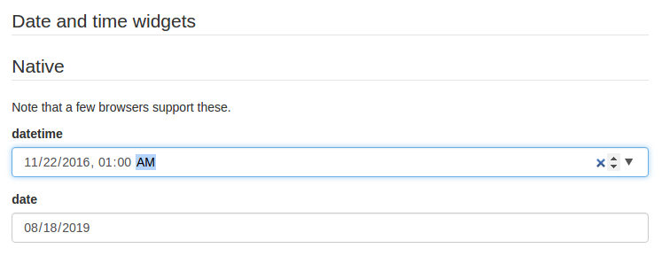
Please note that, even though they are standardized, datetime-local and date input elements are not yet supported by Firefox and IE. If you plan on targeting these platforms, two alternative widgets are available:
alt-datetime: Sixselectelements are used to select the year, the month, the day, the hour, the minute and the second;alt-date: Threeselectelements are used to select the year, month and the day.
Firefox 57 - 66: Firefox partially supporting
dateandtimeinput types, but notdatetime-local,monthorweek

You can customize the list of years displayed in the year dropdown by providing a yearsRange property to ui:options in your uiSchema. Its also possible to remove the Now and Clear buttons with the hideNowButton and hideClearButton options.
uiSchema: {
  a_date: {
    "alt-datetime": {
      "ui:widget": "alt-datetime",
      "ui:options": {
        yearsRange: [1980, 2030],
        hideNowButton: true,
        hideClearButton: true,
      },
    },
  },
},
For number and integer fields
updown: aninput[type=number]updown selector;range: aninput[type=range]slider;radio: a radio button group with enum values. This can only be used whenenumvalues are specified for this input.- By default, a regular
input[type=text]element is used.
Note: If JSONSchema's
minimum,maximumandmultipleOfvalues are defined, themin,maxandstepinput attributes values will take those values.
Disabled fields
The ui:disabled uiSchema directive will disable all child widgets from a given field.
Read-only fields
The ui:readonly uiSchema directive will mark all child widgets from a given field as read-only.
You can also set specific fields to read-only by setting the readOnly property in the schema.
const schema = {
  type: "object",
  properties: {
    foo: {
      type: "string",
      readOnly: true
    }
  }
};
Note: If you're wondering about the difference between a
disabledfield and areadonlyone: Marking a field as read-only will render it greyed out, but its text value will be selectable. Disabling it will prevent its value to be selected at all.
Hidden widgets
It's possible to use a hidden widget for a field by setting its ui:widget uiSchema directive to hidden:
const schema = {
  type: "object",
  properties: {
    foo: {type: "boolean"}
  }
};

const uiSchema = {
  foo: {"ui:widget": "hidden"}
};
Notes:
- Hiding widgets is only supported for
boolean,string,numberandintegerschema types; - A hidden widget takes its value from the
formDataprop.
File widgets
This library supports a limited form of input[type=file] widgets, in the sense that it will propagate file contents to form data state as data-urls.
There are two ways to use file widgets.
- By declaring a
stringjson schema type along adata-urlformat:
const schema = {
  type: "string",
  format: "data-url",
};
- By specifying a
ui:widgetfield uiSchema directive asfile:
const schema = {
  type: "string",
};

const uiSchema = {
  "ui:widget": "file",
};
Multiple files
Multiple files selectors are supported by defining an array of strings having data-url as a format:
const schema = {
  type: "array",
  items: {
    type: "string",
    format: "data-url",
  }
};
Note that storing large dataURIs into form state might slow rendering.
File widget input ref
The included FileWidget exposes a reference to the <input type="file" /> element node as an inputRef component property.
This allows you to programmatically trigger the browser's file selector, which can be used in a custom file widget.
File widget options
accept option
You can use the accept attribute to specify a filter for what file types the user can upload:
const schema = {
  type: "string",
  format: "data-url"
};

const uiSchema = {
  "ui:options": { accept: ".pdf" }
};

render((
  <Form schema={schema}
        uiSchema={uiSchema} />
), document.getElementById("app"));
Object fields ordering
Since the order of object properties in Javascript and JSON is not guaranteed, the uiSchema object spec allows you to define the order in which properties are rendered using the ui:order property:
const schema = {
  type: "object",
  properties: {
    foo: {type: "string"},
    bar: {type: "string"}
  }
};

const uiSchema = {
  "ui:order": ["bar", "foo"]
};

render((
  <Form schema={schema}
        uiSchema={uiSchema} />
), document.getElementById("app"));
If a guaranteed fixed order is only important for some fields, you can insert a wildcard "*" item in your ui:order definition. All fields that are not referenced explicitly anywhere in the list will be rendered at that point:
const uiSchema = {
  "ui:order": ["bar", "*"]
};
Object additional properties
You can define additionalProperties by setting its value to a schema object, such as the following:
const schema = {
  "type": "object",
  "properties": {"type": "string"},
  "additionalProperties": {"type": "number"}
}
In this way, an add button for new properties is shown by default. The UX for editing properties whose names are user-defined is still experimental.
You can also define uiSchema options for additionalProperties by setting the additionalProperties attribute in the uiSchema.
expandable option
You can turn support for additionalProperties off with the expandable option in uiSchema:
const uiSchema = {
  "ui:options":  {
    expandable: false
  }
};
Array item options
orderable option
Array items are orderable by default, and react-jsonschema-form renders move up/down buttons alongside them. The uiSchema object spec allows you to disable ordering:
const schema = {
  type: "array",
  items: {
    type: "string"
  }
};

const uiSchema = {
  "ui:options":  {
    orderable: false
  }
};
addable option
If either items or additionalItems contains a schema object, an add button for new items is shown by default. You can turn this off with the addable option in uiSchema:
const uiSchema = {
  "ui:options":  {
    addable: false
  }
};
removable option
A remove button is shown by default for an item if items contains a schema object, or the item is an additionalItems instance. You can turn this off with the removable option in uiSchema:
const uiSchema = {
  "ui:options":  {
    removable: false
  }
};
Custom CSS class names
The uiSchema object accepts a classNames property for each field of the schema:
const uiSchema = {
  title: {
    classNames: "task-title foo-bar"
  }
};
Will result in:
<div class="field field-string task-title foo-bar" >
  <label>
    <span>Title*</span>
    <input value="My task" required="" type="text">
  </label>
</div>
Custom labels for enum fields
This library supports the enumNames property for enum fields, which allows defining custom labels for each option of an enum:
const schema = {
  type: "number",
  enum: [1, 2, 3],
  enumNames: ["one", "two", "three"]
};
This will be rendered using a select box like this:
<select>
  <option value="1">one</option>
  <option value="2">two</option>
  <option value="3">three</option>
</select>
Note that string representations of numbers will be cast back and reflected as actual numbers into form state.
Alternative JSON-Schema compliant approach
JSON Schema has an alternative approach to enumerations; react-jsonschema-form supports it as well.
const schema = {
  "type": "number",
  "anyOf": [
    {
      "type": "number",
      "title": "one",
      "enum": [
        1
      ]
    },
    {
      "type": "number",
      "title": "two",
      "enum": [
        2
      ]
    },
    {
      "type": "number",
      "title": "three",
      "enum": [
        3
      ]
    }
  ]
};
This will be rendered as follows:
<select>
  <option value="1">one</option>
  <option value="2">two</option>
  <option value="3">three</option>
</select>
This also works for radio buttons:
const schema = {
  "type": "boolean",
  "oneOf": [
    {
      "const": true,
      "title": "Yes"
    },
    {
      "const": false,
      "title": "No"
    }
  ]
};

const uiSchema = {
  "ui:widget": "radio"
};
This will be rendered as follows:
<div class="field-radio-group">
  <div class="radio">
    <label>
      <span>
        <input type="radio" name="0.005549338200675935" value="true"><span>Enable</span>
      </span>
    </label>
  </div>
  <div class="radio">
    <label>
      <span>
        <input type="radio" name="0.005549338200675935" value="false"><span>Disable</span>
      </span>
    </label>
  </div>
</div>
A live example of both approaches side-by-side can be found in the Alternatives tab of the playground.
Disabled attribute for enum fields
To disable an option, use the enumDisabled property in uiSchema.
const schema = {
  type: "string",
  enum: ["one", "two", "three"],
};

const uiSchema={
  "ui:enumDisabled": ['two'],
}
This will be rendered using a select box as follows:
<select>
  <option value="one">one</option>
  <option value="two" disabled>two</option>
  <option value="three">three</option>
</select>
Multiple-choice list
The default behavior for array fields is a list of text inputs with add/remove buttons. There are two alternative widgets for picking multiple elements from a list of choices. Typically this applies when a schema has an enum list for the items property of an array field, and the uniqueItems property set to true.
Example:
const schema = {
  type: "array",
  title: "A multiple-choice list",
  items: {
    type: "string",
    enum: ["foo", "bar", "fuzz", "qux"],
  },
  uniqueItems: true
};
By default, this will render a multiple select box. If you prefer a list of checkboxes, just set the uiSchema ui:widget directive to checkboxes for that field:
const uiSchema = {
  "ui:widget": "checkboxes"
};
Note that when an array property is marked as required, an empty array is considered valid. If array needs to be populated, you can specify the minimum number of items using the minItems property.
Example:
const schema = {
  type: "array",
  minItems: 2,
  title: "A multiple-choice list",
  items: {
    type: "string",
    enum: ["foo", "bar", "fuzz", "qux"],
  },
  uniqueItems: true
};
By default, checkboxes are stacked. If you prefer them inline, set the inline property to true:
const uiSchema = {
  "ui:widget": "checkboxes",
  "ui:options": {
    inline: true
  }
};
See the "Arrays" section of the playground for cool demos.
Autogenerated widget ids
By default, this library will generate ids unique to the form for all rendered widgets. If you plan on using multiple instances of the Form component in a same page, it's wise to declare a root prefix for these, using the ui:rootFieldId uiSchema directive:
const uiSchema = {
  "ui:rootFieldId": "myform"
};
So all widgets will have an id prefixed with myform.
Form action buttons
You can provide custom buttons to your form via the Form component's children. Otherwise a default submit button will be rendered.
render((
  <Form schema={schema}>
    <div>
      <button type="submit">Submit</button>
      <button type="button">Cancel</button>
    </div>
  </Form>
), document.getElementById("app"));
Warning: There needs to be a button or an input with
type="submit"to trigger the form submission (and then the form validation).
Help text
Sometimes it's convenient to add text next to a field to guide the end user filling it. This is the purpose of the ui:help uiSchema directive:
const schema = {type: "string"};
const uiSchema = {
  "ui:widget": "password",
  "ui:help": "Hint: Make it strong!"
};

Help texts work for any kind of field at any level, and will always be rendered immediately below the field component widget(s) (after contextualized errors, if any).
Title texts
Sometimes it's convenient to change a field's title. this is the purpose of the ui:title uiSchema directive:
const schema = {type: "string"};
const uiSchema = {
  "ui:widget": "password",
  "ui:title": "Your password"
};
Description texts
Sometimes it's convenient to change the description of a field. This is the purpose of the ui:description uiSchema directive:
const schema = {type: "string"};
const uiSchema = {
  "ui:widget": "password",
  "ui:description": "The best password"
};
Auto focus
If you want to automatically focus on a text input or textarea input, set the ui:autofocus uiSchema directive to true.
const schema = {type: "string"};
const uiSchema = {
  "ui:widget": "textarea",
  "ui:autofocus": true
}
Textarea rows option
You can set the initial height of a textarea widget by specifying rows option.
const schema = {type: "string"};
const uiSchema = {
  "ui:widget": "textarea",
  "ui:options": {
    rows: 15
  }
}
Placeholders
You can add placeholder text to an input by using the ui:placeholder uiSchema directive:
const schema = {type: "string", format: "uri"};
const uiSchema = {
  "ui:placeholder": "http://"
};

Fields using enum can also use ui:placeholder. The value will be used as the text for the empty option in the select widget.
const schema = {type: "string", enum: ["First", "Second"]};
const uiSchema = {
  "ui:placeholder": "Choose an option"
};
Field labels
Field labels are rendered by default. Labels may be omitted by setting the label option to false in the ui:options uiSchema directive.
const schema = {type: "string"};
const uiSchema = {
  "ui:options": {
    label: false
  }
};
HTML5 Input Types
To change the input type (for example, tel or email) you can specify the inputType in the ui:options uiSchema directive.
const schema = {type: "string"};
const uiSchema = {
  "ui:options": {
    inputType: 'tel'
  }
};
Form attributes
The Form component supports the following html attributes:
<Form
  id="edit-form"
  className="form form-wide"
  name="awesomeForm"
  method="post"
  target="_blank"
  action="/users/list"
  autocomplete="off"
  enctype="multipart/form-data"
  acceptcharset="ISO-8859-1" />
Disabling a form
It's possible to disable the whole form by setting the disabled prop. The disabled prop is then forwarded down to each field of the form.
<Form
  disabled
  schema={} />
If you just want to disable some of the fields, see the ui:disabled parameter in the uiSchema directive.
Changing the tag name
It's possible to change the default form tag name to a different HTML tag, which can be helpful if you are nesting forms. However, native browser form behaviour, such as submitting when the Enter key is pressed, may no longer work.
<Form
  tagName="div"
/>